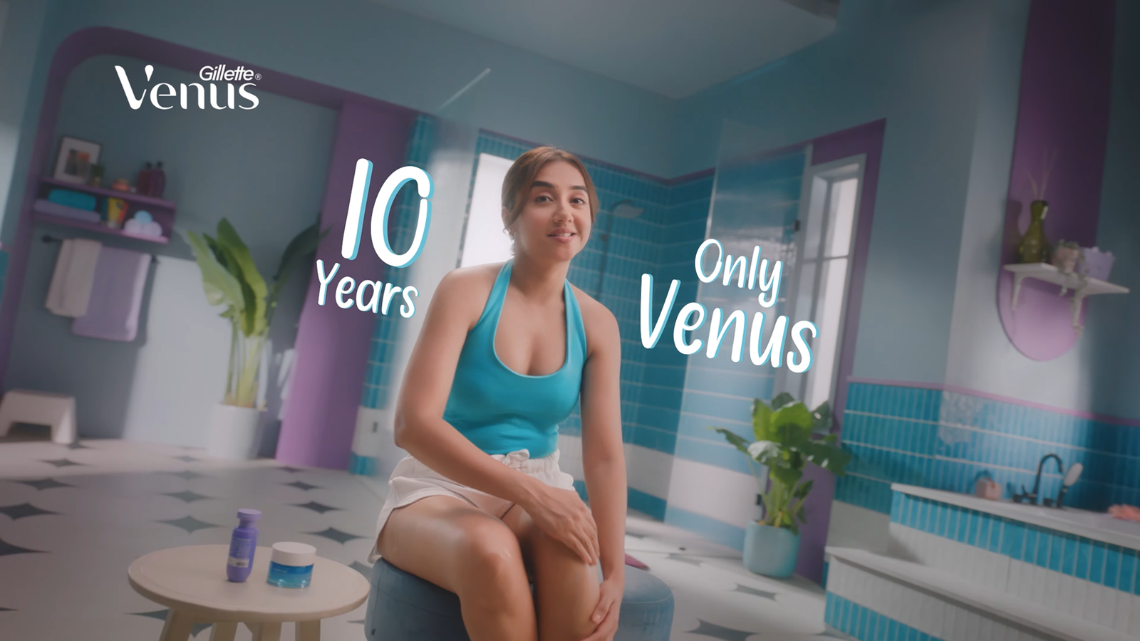
A Stylised Intimate Space
This set was conceived as a controlled reality — a bathroom that feels familiar, yet heightened.
The intention was not to replicate a typical residential space, but to create a visually expressive
environment where colour, geometry and texture become part of the storytelling
1. Spatial Language & Architectural Form
The primary design device was the use of arches and softened geometry.
Rounded thresholds, curved wall frames, and circular motifs in the flooring create a rhythmic
visual continuity throughout the set. These curves counterbalance the linear discipline of the
vertical tiles, resulting in a space that feels both structured and fluid.
The arches are not merely decorative — they frame moments.
They create depth for camera movement and allow the actor to transition through layers of
space, enhancing cinematic blocking.
⸻
2. Colour Strategy
The palette was intentionally bold yet harmonious.
• Muted teal-blue walls create a calm base.
• Glossy turquoise tiles introduce movement through reflection.
• Lilac and deep purple accents inject personality and softness.
• Matte black fixtures anchor the vibrancy with contrast.
The colour blocking was designed in zones — each arch and recess subtly shifts
tone, allowing the camera to capture dynamic compositions without the need for
excessive set dressing.
The result: a bathroom that feels playful, confident, and slightly editorial.
⸻
3. Surface & Texture Play
Texture was crucial in elevating the set beyond flat colour.
• Handmade-look vertical tiles add tactility and light play.
• The large-format circular patterned flooring introduces graphic drama.
• Stone countertops soften the vibrancy with a grounded materiality.
• Matte painted walls absorb light, preventing visual fatigue.
The mix of gloss and matte surfaces was carefully balanced to ensure the space
performs well under lighting without creating harsh reflections.
4. Functional Realism with Stylised Detailing
Although the set leans toward stylisation, every element remains functional:
• Open shelving creates lived-in credibility.
• Plants add organic contrast to the geometric rigidity.
• Soft textiles (towels, bath mat, stool upholstery) humanise the space.
• Recessed shower niches were designed to add depth while offering natural
product placement moments.
The goal was to maintain authenticity while allowing the space to feel slightly
aspirational.
⸻
5. Lighting Collaboration
The set was designed in close collaboration with lighting.
Large window openings allow motivated natural light to sculpt the tiles, creating gradients across
surfaces.
Wall sconces with exposed filament bulbs add warmth against the cooler palette, preventing the
space from feeling sterile.
Shadows were embraced intentionally — especially within arches and recesses — to create
dimensionality and cinematic contrast.
⸻
6. Camera Consideration
From a production design standpoint, the layout was built to serve the lens:
• Multiple framing opportunities (mirror shots, arch framing, layered
backgrounds).
• Depth created through staggered planes.
• Negative space maintained for talent movement.
• Colour separation to ensure costume and skin tones stand out.
The set reads differently from every angle — which was a key objective.
⸻
7. Conceptual Thought
At its core, this set explores the idea that even the most intimate daily rituals deserve
theatricality.
Bathrooms are often private and overlooked spaces. Here, we treated it as a stage — where
routine becomes performance, and design elevates the everyday.
